


Overview
This post is intended to serve as a reference for future posts. If there are any unknown aspects, you can easily check them in the Table of contents on the right side of this post.
You don’t need to read it from start to finish; just check the theme and style, and you can refer back to other contents later if you encounter any unfamiliar topics (links will be provided).
Additionally, the contents here will be periodically updated as necessary.
Themes
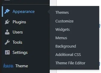
If you go to the main WordPress admin page, you will see “Appearance – Themes” on the left sidebar.
In the Korean version, “Appearance” seems to be displayed as ‘외모’, but I found that the translation is harder to understand, so I prefer to use the English version.
So, what is a theme? WordPress is not a platform like Naver Blog. It is a tool designed to make it easier to create websites.
Therefore, installing WordPress does not automatically create a structure like Naver Blog, where you can just post articles. Users have to build it piece by piece.
It might be difficult to create everything from scratch at first. Think of themes as a way to help with that.
Themes provide a basic framework. You can choose a theme you like and install it, and then customize it to your taste.
Even beginners can build a functional website with a suitable theme, and you will be able to post articles as well. For example, the methods explained by YouTuber ‘Roalnam’ also utilize themes in WordPress.
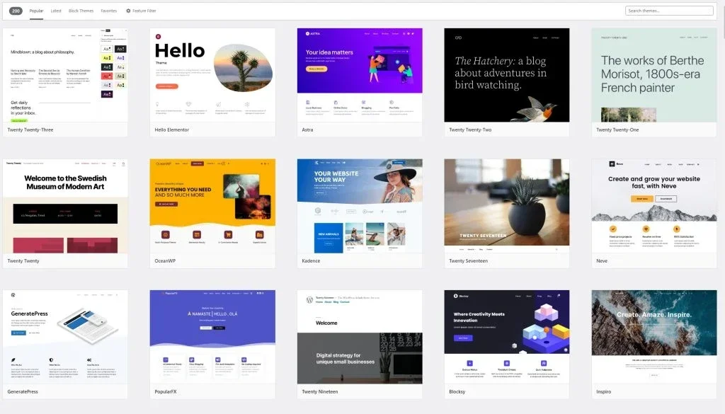

When you click “add new” under Themes, you can download and apply many themes. You can also search in the top right corner, and if you have a theme, you can upload it for use.
In my case, I enjoy building from the ground up without using a specific theme, so I use the Kava Child Theme included in Crocoblock.
Don’t worry about using a different theme. The basic usage is the same, and the differences are only in the initial structure, so in the end, it’s about modifying it to your preference.
Do you see the Customize button? It’s a theme modification button where you can set the basic colors, font formats, site logo, etc. Let’s take a look.
Theme Customization
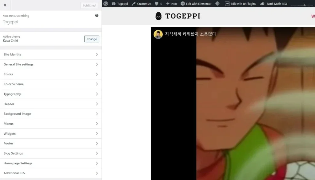
This is the Customize entry screen for my TogePi blog. I will briefly explain each part.
(1) Site Identity
You can set the site title and tagline here.
(2) General Site Settings
You can set the favicon, page layout, breadcrumbs, top button, etc.
In terms of layout, I set it to Full width, but feel free to choose according to your preference. This setting can also be changed during page edits later, so you don’t have to touch it if you don’t want to.
I haven’t used the breadcrumbs feature here.
The top button appears when you scroll down the page and takes you back to the top; you can add it according to your taste. If you want to change the appearance of this button, refer to the ‘Style’ section that will be described later.
(3) Colors / Color Scheme
You can set the background color, basic text color, and link colors here.
However, since individual settings can be specified during the website building process, you generally don’t need to change this, but you can modify basic colors displayed by widgets that can’t be customized in other settings.
(4) Typography
You can specify sizes, thicknesses, widths, etc. for the font formats from H1 to H6.
You can also specify buttons and body text, but I’ve set only H1 to H6 separately. In this text, I use H1, H2 for titles and H5 for content.
Instead of setting everything from the start, it might be easier to see how it displays when you write content later and modify it then.
(5) Homepage Settings
You can specify which page will serve as your website’s homepage. The homepage is also where you can send visitors when they click the logo.
The Header / Background Image / Menus / Widgets that are not mentioned can be set separately, so you don’t necessarily need to configure them now unless needed. Please note that this content is based on the Kava Child theme, so the settings may vary by theme.
Widget Detailed Settings
There are various types of widgets, right? The capture above shows the Button widget, and there are also many others like text, image, icons, etc. The style applications for these various widgets are somewhat similar, and I’m going to explain that.
To explain in a basic manner, the button widget seems the most convenient. It is widely used as well.
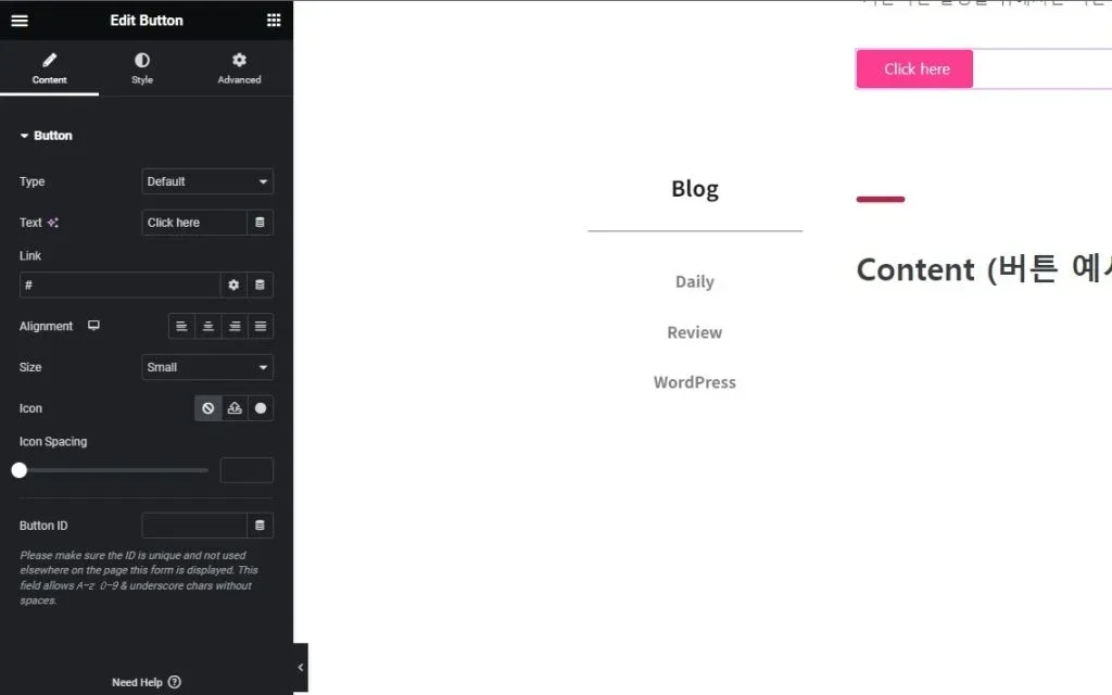
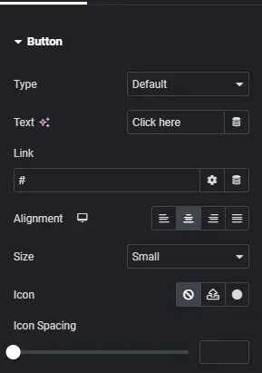
Content
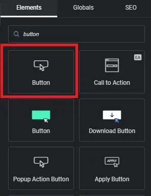
If you search for buttons in the left sidebar, you will see various options. I generally use the button from Crocoblock, but for this explanation, I’ll use the default WordPress button.
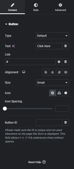
When you click the button widget, you will see the Content window first.
Type is fine to leave as the default.
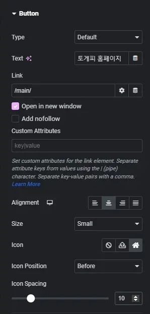
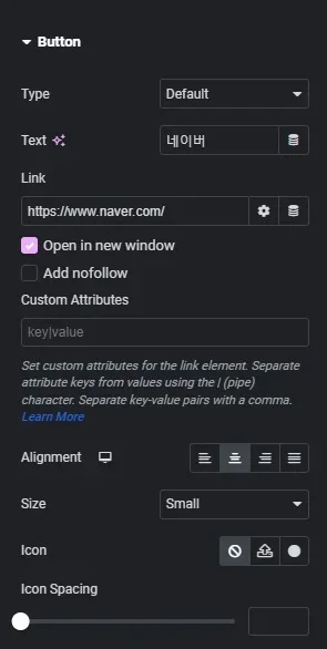
(1) Text
You can change the name of the button here.
(2) Link
When the button is clicked, it will direct you to the set link. The default # will not perform any action. This # is also used in menu settings later.
You can link to pages within your website or to other site links. When linking to another site, just copy the URL and paste it. Similarly, you can link to a page within your website by entering /slug/ if you know the slug.
There are two buttons on the right, one for settings and one like a pancake. Let’s check the settings button first.
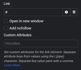
Clicking the gear icon (Link Options) will reveal the dropdown below. The link functions are as mentioned above, but there are two other details to explain.
Open in New Window
If you activate the Open in new window button, when you click this button, it will open the link in a new window without leaving the current page.
This is potentially important for SEO, as it evaluates how long users stay on a page (you might not need to know this at this stage). Simply put, if the current page remains open while a new window with external content opens, it contributes positively to your SEO score. However, for ad revenue, many websites require you to see ads before you can view content, so this could somewhat negatively impact income.
Add Nofollow
This function isn’t critical to know at this stage either. This ties to SEO as well.
To summarize, if you link to another page, traffic increases that page’s SEO score. If you activate this feature, the link will have a nofollow attribute, preventing it from counting as a visitor, and thus not affecting SEO scores.
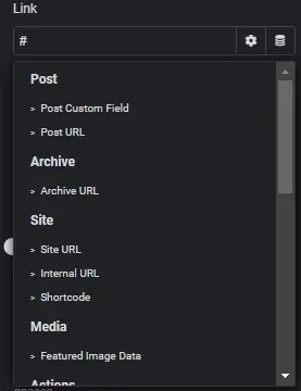
This is what you see when you click the pancake-shaped button (Dynamic Tags).
At first, I found this function quite complicated, but as I became more accustomed to it, it became a convenient feature. You don’t really need to worry about it right now. You don’t need to often apply it to buttons!
Dynamic features are included in Crocoblock’s JetEngine and Elementor, for example, and I think they are mainly used when there’s a need to pull data.
For example, when you write a post and want to display its title, you input it when writing, but to include it in the content, you would need to write that text again. Dynamic functionality helps organize that since it pulls the title from what you’ve already written.
If you click Post URL for setting it up, it will take the URL information of the currently viewed post.
(3) Alignment
You can decide how to align it, which you probably already know. I’ll skip the size section.
(4) Icon
You can set an icon at the front of the button title. If you only set an icon and leave the title blank, only the icon will remain.
The Icon Spacing below controls the distance between the icon and the text.
Now, I’ll create an actual button to help you easily understand what settings were made and to illustrate how it looks.
Due to the color settings from the earlier mentioned Theme Customize, my button appears in pink by default. Please take note!
When you click the button, it will take you to the destination as displayed in the captured images above!
Style
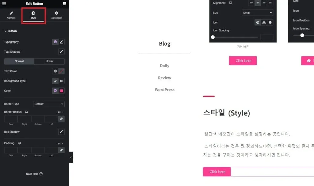
The red rectangle is where you can set the style.
Style refers to defining the font, color, size, background, width, margin, and border of the selected widget, essentially decorating what is displayed.
Again, I’ll explain using the button widget as an example.
(1) Typography
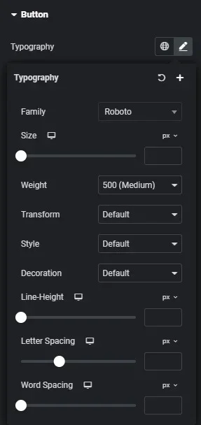
Family: Specify the font type.
Size: Specify the font size.
Weight: Specify how thick the font should be.
Transform: Set the text case.
Style: Specify the font style (italic, normal, etc.).
Decoration: Add decorations like underlines to the text.
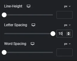
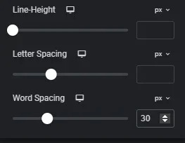
Line-Height: Adjust the vertical spacing of the text.
Letter Spacing: Adjust the horizontal spacing of individual letters.
Word Spacing: Adjust the horizontal spacing of whole words.
The difference between Letter Spacing and Word Spacing can be confusing; it might be clearer to see actual applications below.
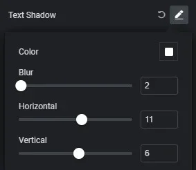
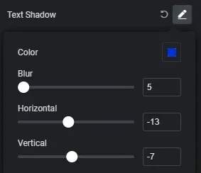
(2) Text Shadow
I don’t usually use this feature, but it adds a shadow effect behind the text. Check the button below for reference.
I have exaggerated the effect to clearly show the differences.
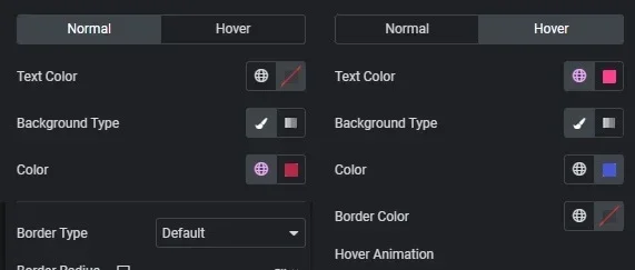
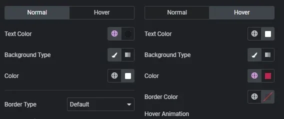
(3) Normal / Hover
You may have noticed that when you hover over a button, its color changes or gives a responsive feel. This feature allows you to set this up.
Hover typically refers to when the mouse is over the button. The term mouse hover indicates this action.
Normal represents how the button will display when it is not interacted with, while Hover indicates how it should change when the mouse is over it.
Text Color: Specify the text color.
Background Type: Choose whether the background will be solid color or gradient.
Color: Represents the color setting that appears when the Background is specified.
Border Color: Specify the border color if it exists.
Hover Animation: Specify the effect that occurs when hovering.
Now, let’s look at the buttons below to see the effects of these settings.
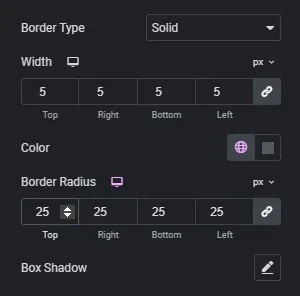
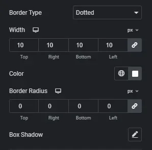
(4) Border
The border, as mentioned earlier, is simply the widget’s outline.
This section allows you to set up the borders of the widget. It’s simple.
Border Type: Specify whether the border will be solid or dashed.
Width: Specify the thickness of the border.
Border Radius: Specify the roundness or sharpness of the corners.
Box Shadow: Similar to the shadow functionality mentioned earlier.
Let’s look at the buttons configured below to see the differences.
(5) Padding
Here’s a new concept: padding. It might remind you of winter clothing! The meaning of padding, which actually refers to insulation, is quite similar.
Padding refers to adding space around the widget’s edges.
There’s a setting coming up called Margin, which is very similar, and I initially found it confusing. To clarify, I usually use padding to increase the size of the widget and margin to decrease it.
So let’s see the buttons below to understand the concept clearly.
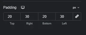
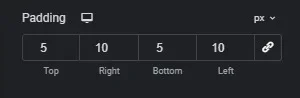
Can you feel the difference?
The “px” next to the numbers indicates whether you’re adjusting the size in pixels or percentages of the overall size.
The chain icon represents a sync function. For example, in a car’s air conditioner, you can sync the passenger’s and driver’s settings. If you activate the sync icon and make a change, the values for top, bottom, right, and left will be set to the same number, allowing you to manage them together.
So, that wraps up the style settings for the button widget.
Advanced
-Content to be added soon-
In summary, padding adds space around the edges of the widget, while margin affects the spacing between the widget and other elements.
The numbers next to the settings specify the measurement, indicating whether it’s in pixels (px) or percentages.
The chain icon represents a sync function that allows you to apply the same values across multiple edges (top, bottom, left, right) when activated.
That concludes the button widget’s style settings.
Advanced
-Additional content will be added soon-