


Style
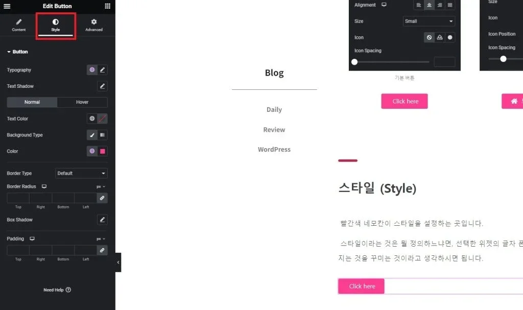
The red square is where the style is set.
Style can be defined as decorating what is visually presented, such as the font, color, size of the text, background, width and margin above and below, and borders of the selected widget.
I will explain the style using the button widget as an example.
(1) Typography
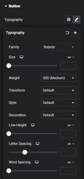
Family: Specifies the font.
Size: Specifies the font size.
Weight: Specifies the font thickness.
Transform: Specifies capitalization.
Style: Specifies font style.
Decoration: Allows adding underline or other decorations to the text.
Line-Height: Adjusts the vertical spacing of the text.
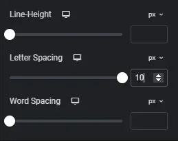
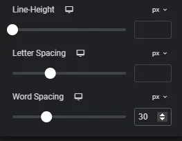
Letter Spacing: Adjusts the horizontal spacing of each letter.
Word Spacing: Adjusts the horizontal spacing between words.
Letter Spacing and Word Spacing may be confusing, but you can understand them better by looking at the actual application below.
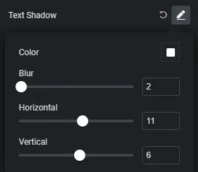
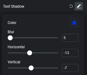
(2) Text Shadow
This is a feature I don’t use much, but it adds a shadow effect behind the text. Please refer to the buttons below.
Depending on the settings, there can be significant differences; I’ve exaggerated the effects to clearly show those differences.
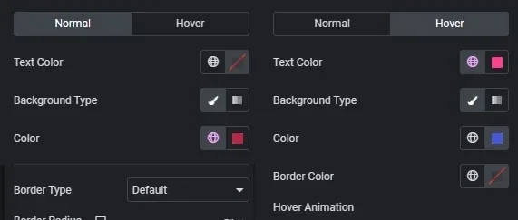
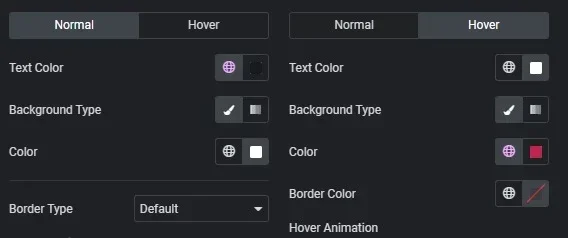
(3) Normal / Hover
You’ve probably seen buttons change color or react when you hover over them, right? This is the setting for that functionality.
“Hover” generally refers to mouse hovering. You can think of it as a helicopter hovering in place. When the mouse is above the button, it is called Hover.
Normal refers to how the button is displayed when not being interacted with, while Hover indicates how it changes when the mouse is over it.
Text Color: Specifies the color of the text.
Background Type: Specifies whether the background color is solid or gradient.
Color: This is the configuration field that appears when Background is set, allowing you to specify the background color.
Border Color: Specifies the border color when there is a border.
Hover animation: Specifies the effect when hovering.
Now, let’s look at the buttons below to see the effects they create.
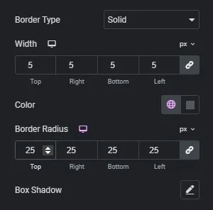
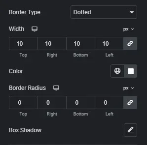
(4) Border
Border, as mentioned above, refers to the outline.
This setting allows you to customize the border of the widget. It’s not difficult at all.
Border type: Specifies how the border will be drawn, such as solid or dashed.
Width: Specifies the thickness of the border.
Border Radius: Controls whether the corners of the border are rounded or square.
Box shadow: Similar to the shadow function mentioned above.
Please check the differences with the buttons below.
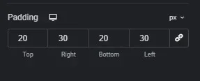
(5) Padding
A new concept has emerged. Padding can remind you of winter clothing, right? The meaning of padding actually relates to insulation, which is similar here.
Padding is the feature that adds space around the border of the widget.
There’s another similar setting called Margin, and it confused me a lot at first. To explain, I think of Padding as used to enlarge the size of the widget and Margin as used to reduce the size.
Now, let’s see the effects in the buttons below.
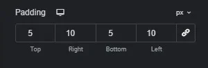
Do you feel the difference?
The “px” next to the numbers means whether to adjust in pixel units or percentage of the total size.
The feature represented by a chain shape is the Sync function. Just like in a car’s air conditioning, where there’s a sync option for driver and passenger sides, activating this button allows you to set the same value for Top, Bottom, Right, and Left by synchronizing them.
This concludes the explanation of the style settings for the Button widget.
Advanced
-Content to be added-
-Content to be added-